
New business card...
 May 29, 2009 | 12:50 PM
#11
Thread Starter
| Teamspeed Junior Member
Joined: Jul 2008
Posts: 97
From: Chicago, IL


Ever since I ordered some yesterday, I was wondering what shadows would look like...
As for the background, I'm going to take some photos of some beading and pick a good one for the next batch of cards.
May 29, 2009 | 01:34 PM
#13
Thread Starter
| Teamspeed Junior Member
Joined: Jul 2008
Posts: 97
From: Chicago, IL
That's true... thanks for the compliments!
May 29, 2009 | 02:40 PM
#14
Teamspeed's Official Brain Surgeon
Joined: Oct 2008
Posts: 887
From: WV
sorry for a late comment, but at first glance the overall pattern looks a little like a swastika. I know this will come off as a lousy thing to say, but I am just being honest and trying to give you feedback. When the image first came up and my eyes didn't focus immediately that is what I saw. If no one else sees it then great, I hope I am wrong. Please take this feedback in the manner in which it is meant.
May 29, 2009 | 02:47 PM
#15
Thread Starter
| Teamspeed Junior Member
Joined: Jul 2008
Posts: 97
From: Chicago, IL
sorry for a late comment, but at first glance the overall pattern looks a little like a swastika. I know this will come off as a lousy thing to say, but I am just being honest and trying to give you feedback. When the image first came up and my eyes didn't focus immediately that is what I saw. If no one else sees it then great, I hope I am wrong. Please take this feedback in the manner in which it is meant.
May 29, 2009 | 03:06 PM
#16
TEAMSPEED.COM

Joined: Aug 2007
Posts: 4,457
From: Pittsburgh, PA
First thoughts? Not a fan of putting things in the bottom corners; you're hurting some of the creative awesomeness you've got going on with the rest of the card. I'll come up with an idea later (for your next batch  ).
).
Now, some suggestions.
1. UV Spot finish the water droplets.
2. Ditch the gradients, opting to go for silver foil-stamping on all type and the logo.
3. Logo + logotype on front. Contact details, sans logo, on back.
I just sent off a set to the printer for an event next weekend myself, using Print100 out of Hong Kong. They can't be beat.
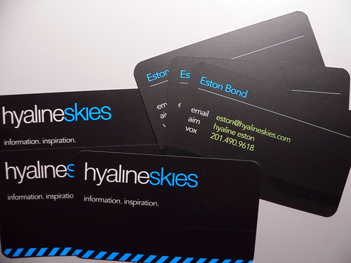
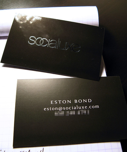
I've linked a few files from an awesome designer, Eston Bond, that show off silver foil stamping & the UV finish as a final product. First ones I found, but you can see how good both treatments can look when used properly.
).Now, some suggestions.
1. UV Spot finish the water droplets.
2. Ditch the gradients, opting to go for silver foil-stamping on all type and the logo.
3. Logo + logotype on front. Contact details, sans logo, on back.
I just sent off a set to the printer for an event next weekend myself, using Print100 out of Hong Kong. They can't be beat.
I've linked a few files from an awesome designer, Eston Bond, that show off silver foil stamping & the UV finish as a final product. First ones I found, but you can see how good both treatments can look when used properly.
May 29, 2009 | 05:11 PM
#17
Thread Starter
| Teamspeed Junior Member
Joined: Jul 2008
Posts: 97
From: Chicago, IL
First thoughts? Not a fan of putting things in the bottom corners; you're hurting some of the creative awesomeness you've got going on with the rest of the card. I'll come up with an idea later (for your next batch ).
Now, some suggestions.
1. UV Spot finish the water droplets.
2. Ditch the gradients, opting to go for silver foil-stamping on all type and the logo.
3. Logo + logotype on front. Contact details, sans logo, on back.
I just sent off a set to the printer for an event next weekend myself, using Print100 out of Hong Kong. They can't be beat.
I've linked a few files from an awesome designer, Eston Bond, that show off silver foil stamping & the UV finish as a final product. First ones I found, but you can see how good both treatments can look when used properly.
).Now, some suggestions.
1. UV Spot finish the water droplets.
2. Ditch the gradients, opting to go for silver foil-stamping on all type and the logo.
3. Logo + logotype on front. Contact details, sans logo, on back.
I just sent off a set to the printer for an event next weekend myself, using Print100 out of Hong Kong. They can't be beat.
I've linked a few files from an awesome designer, Eston Bond, that show off silver foil stamping & the UV finish as a final product. First ones I found, but you can see how good both treatments can look when used properly.
What do you mean by UV spot finishing the water droplets?
Here's the 2 minute draft of where I might/will go with it...
Front:


Back:

Also, what do you think about making the back upside down, so when the card is rotated around the x axis, the back side is right side up? I have that on my current cards and can't say if I like it or dislike it, but on this design (or future one like above) it might be pretty cool...?
Last edited by Ivan Rajic; May 29, 2009 at 05:51 PM.
May 29, 2009 | 05:40 PM
#18
TEAMSPEED.COM
Joined: Aug 2007
Posts: 4,457
From: Pittsburgh, PA
I've attached a very light modification to your cart. Rotated the logo and background (I really think your logo benefits from a straightened position) and darkened the rest of the card so that the logo stands out more.
I'd get rid of the gradients in the logo and go with the straight silver foil stamping. UV finish will basically give you spots of a glossy coat that contrast with the rest of the matte finish. When the lights hit it, your eyes will be drawn. It's an awesome technique that can add a lot, but has to be used carefully. I've attached a second image with spots I'd hit in red (to be truthful, I think I'm on the heavy end -- you'd just want to hit some of the water spots, and the larger ones at that, to avoid it from being too much). (The spots aren't actually red in real life, by the way -- that's just how you mark them).
Ignore the rushed quality. I was, more or less, just experimenting.
May 29, 2009 | 05:54 PM
#19
Thread Starter
| Teamspeed Junior Member
Joined: Jul 2008
Posts: 97
From: Chicago, IL
I've attached a very light modification to your cart. Rotated the logo and background (I really think your logo benefits from a straightened position) and darkened the rest of the card so that the logo stands out more.
I'd get rid of the gradients in the logo and go with the straight silver foil stamping. UV finish will basically give you spots of a glossy coat that contrast with the rest of the matte finish. When the lights hit it, your eyes will be drawn. It's an awesome technique that can add a lot, but has to be used carefully. I've attached a second image with spots I'd hit in red (to be truthful, I think I'm on the heavy end -- you'd just want to hit some of the water spots, and the larger ones at that, to avoid it from being too much). (The spots aren't actually red in real life, by the way -- that's just how you mark them).
Ignore the rushed quality. I was, more or less, just experimenting.
I'd get rid of the gradients in the logo and go with the straight silver foil stamping. UV finish will basically give you spots of a glossy coat that contrast with the rest of the matte finish. When the lights hit it, your eyes will be drawn. It's an awesome technique that can add a lot, but has to be used carefully. I've attached a second image with spots I'd hit in red (to be truthful, I think I'm on the heavy end -- you'd just want to hit some of the water spots, and the larger ones at that, to avoid it from being too much). (The spots aren't actually red in real life, by the way -- that's just how you mark them).
Ignore the rushed quality. I was, more or less, just experimenting.
As for rotation, there's been debate and I like it rotated a lot more.
May 29, 2009 | 06:24 PM
#20
TEAMSPEED.COM
Joined: Aug 2007
Posts: 4,457
From: Pittsburgh, PA
Sorry but I'm still not following the UV finish... you want me to touch them up after the cards are printed or to spot the few drops a certain way in PS so the UV coating during printing process gives it the effect?
As for rotation, there's been debate and I like it rotated a lot more.
As for rotation, there's been debate and I like it rotated a lot more.
And regarding rotation, that's fine.
