Evaluate my detail shots and architecturals
#1
Evaluate my detail shots and architecturals
Most of these taken with a Nikkor DX 18-55 3.5-5.6 on D50 with sb-600.
Detail Shots
New Favorite Lense
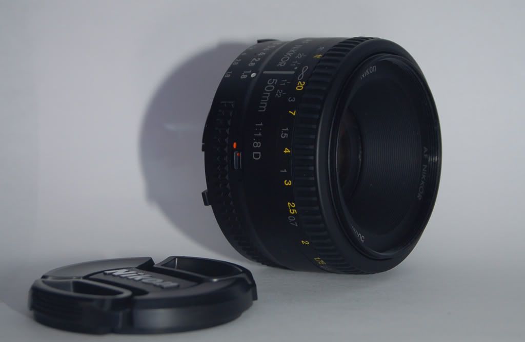
What would be the best way to photoshop out the background reflection without ruining the reflection? Next time I'll just adjust the home made light box.

Whisperer

One of my first shots with the speed flash

HDR'd with a Raw image then some intense Noise Ninja'ing

Already posted this one, high speed shot, taken before I had my speed flash. Make shift light box in the sink.

Architecturals Still working on these, taken with the same setup as above except no need for flash.
All of them are HDR but I think I need to redo some of the tone mapping on a few of them.
These are to be published so they need to as good as possible. Any critism is very welcome.
First time shooting something as boring as a mostly unfurnished school, had trouble finding good shots seeing as their were still workers doing a few things leaving many places too dirty or occupied to shoot.
Still need to touch up some of the ugly spots around the air vents.

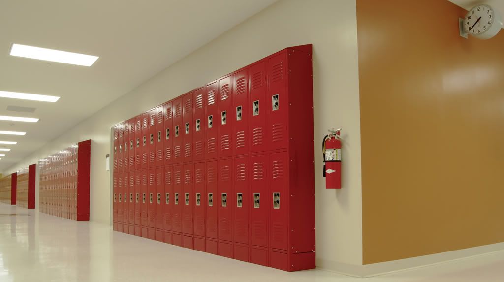
f/20
1/5sec
18mm
Had trouble cleaning up the dark spots on the sides of the lockers in tone mapping.
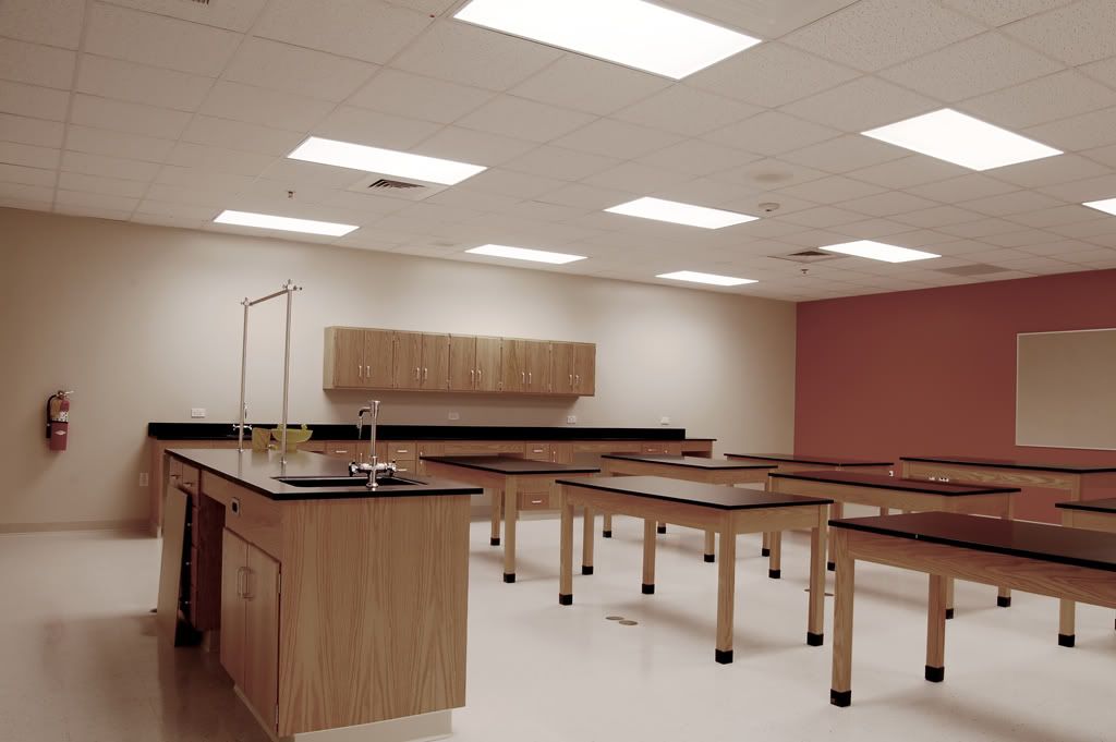
f/22
3sec
18mm
Had moved that wooden board leaning against the table for another shot, forgot about it for this one.
f/11
1/3sec
18mm
Tips?
Detail Shots
New Favorite Lense


What would be the best way to photoshop out the background reflection without ruining the reflection? Next time I'll just adjust the home made light box.

Whisperer

One of my first shots with the speed flash

HDR'd with a Raw image then some intense Noise Ninja'ing

Already posted this one, high speed shot, taken before I had my speed flash. Make shift light box in the sink.

Architecturals Still working on these, taken with the same setup as above except no need for flash.
All of them are HDR but I think I need to redo some of the tone mapping on a few of them.
These are to be published so they need to as good as possible. Any critism is very welcome.
First time shooting something as boring as a mostly unfurnished school, had trouble finding good shots seeing as their were still workers doing a few things leaving many places too dirty or occupied to shoot.
Still need to touch up some of the ugly spots around the air vents.

f/20
1/5sec
18mm
Had trouble cleaning up the dark spots on the sides of the lockers in tone mapping.

f/22
3sec
18mm
Had moved that wooden board leaning against the table for another shot, forgot about it for this one.

f/11
1/3sec
18mm
Tips?
#2
those are very good! but then again, i am no critic! i just got a D40 after having a disposable camera! 
i like the picture of the green circle with the reflection. what is it? it looks like a fruit loop!

i like the picture of the green circle with the reflection. what is it? it looks like a fruit loop!

#3
You're going to have some trouble cleaning up the side of the lockers without getting your hands dirty & doing some repair work. Anyhow, I can echo how boring & mundane a school is when empty - you just need to work harder to find the angles & light that can overcome that. From what I see, you're doing just that.
As far as the sunglasses are concerned, Photoshop isn't the way to go. The image is flawed from the getgo; you need to work on your light box & positioning. Yes, you could feasibly work some magic with some time & elbow grease, but that's not the right way to go about it.
Nail it in camera and only use Photoshop to take it to the next level where necessary.
#4
You're going to have some trouble cleaning up the side of the lockers without getting your hands dirty & doing some repair work. Anyhow, I can echo how boring & mundane a school is when empty - you just need to work harder to find the angles & light that can overcome that. From what I see, you're doing just that.
As far as the sunglasses are concerned, Photoshop isn't the way to go. The image is flawed from the getgo; you need to work on your light box & positioning. Yes, you could feasibly work some magic with some time & elbow grease, but that's not the right way to go about it.
Nail it in camera and only use Photoshop to take it to the next level where necessary.
As far as the sunglasses are concerned, Photoshop isn't the way to go. The image is flawed from the getgo; you need to work on your light box & positioning. Yes, you could feasibly work some magic with some time & elbow grease, but that's not the right way to go about it.
Nail it in camera and only use Photoshop to take it to the next level where necessary.
I couldn't agree more. Some photos are just not meant to be edited out of the camera. They would just not ever be worth the effort to fix them.
Take it from me, I just went through this exact scenario with a recent shoot.
My lesson learned? Take the time to set up the photo perfect from the beginning. You will thank yourself later when you save hours in Photoshop.
#5
Ditto on that lesson. Learned it myself as well "ah, I can fix that in PShop ... hours later ... dammit shoud've taken my time and shoot it properly!"
Some observations, keep in mind I'm no pro.
Your lighting isn't right. You need a lightbox. They're easy to find/fabricate (hit up Google with DIY lightbox or something) and make a world of difference. This being said, it looks awesome on the glasses and gun shots. Very dark almost cartoon feel. Of course the reflection on the glasses is effed up, but the lighting still is nice. On the lens shots though ... disaster.
Focus looks to be off ... in the first shot you want that lens to be in focus ... playing with DoF is fun ... but in this case it makes my brain melt. Same for the gun shot, the lettering on the silencer is blurry.
Not sure what you were going for with the lighter pic ...
First architectural shot, your use of HDR is perfect, not overdone, just right.
Not sure it adds anything to the other pics ... Going lower than 18mm would most certainly help IMO to give some feeling of space. As they are now, they aren't colorful enough to be fun, yet too colourful to be eerie. I'm assuming the school wants a cheerful image of their building, so in that regard, it could use more contrast and colour ... The reflections on the lockers have to go some way or another.
This is all IMO, obviously.
#6
Good pictures, but to me it just seemed like a lot of them still had some color/lighting adjustmetns done... Mostly forground lighting and highlights.
Here's some quick re-colors I did, don't know if I made them better or worse.


Here's some quick re-colors I did, don't know if I made them better or worse.


#8
Good pictures, but to me it just seemed like a lot of them still had some color/lighting adjustmetns done... Mostly forground lighting and highlights.
Here's some quick re-colors I did, don't know if I made them better or worse.
Here's some quick re-colors I did, don't know if I made them better or worse.
#9
Going through the architecturals again right now, I'll post the results.
Thread
Thread Starter
Forum
Replies
Last Post
RonnieRenaldi
Aventador | Hurac�n | Murcielago | Gallardo
6
May 3, 2012 05:51 PM
RonnieRenaldi
Supercars
22
Oct 4, 2010 10:40 AM
Bookmarks
Currently Active Users Viewing This Thread: 1 (0 members and 1 guests)


