
View Poll Results: Whose photos are better?
Alzilla's


25
42.37%
Atomic80's


34
57.63%
Voters: 59. You may not vote on this poll
The Turbo Kid got a Ferrari!
 Aug 16, 2010 | 10:44 PM
#51
TS BMW Forums

Joined: Sep 2008
Posts: 3,144
From: Rochester Hills, MI


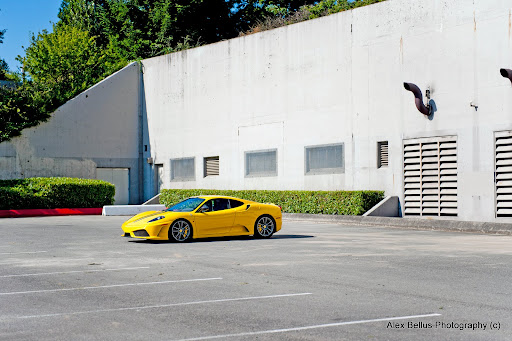
Alex #4: Lighting, and nice building in the background. I really like low light, evening shots. I'm a sucker for them really.
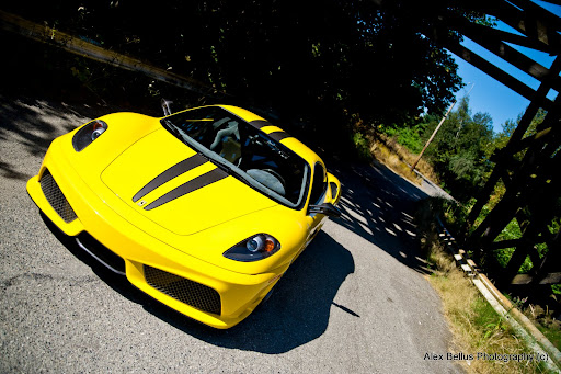
Jason #2: This angle really shows off the beautiful lines and body work of your Scud.
You're both very talented. Thanks for sharing your work.
Jason #2: This angle really shows off the beautiful lines and body work of your Scud.
You're both very talented. Thanks for sharing your work.
Aug 16, 2010 | 11:16 PM
#53
Photographer Extraordinaire
Joined: Aug 2007
Posts: 5,879
From: Bellevue, WA
[QUOTE=h20skier;686979] I've posted non photochopped images before you know...
I'm not a big fan of making images look "dramatic" beyond a certain measure which is why I avoided going too far. I like keeping the images as faithful as possible while at the same time tweaking it enough to give it a style of its own if that even makes sense.
Further proof that these guys can't take good photos they just no how to work PhotoChop
Further proof that these guys can't take good photos they just no how to work PhotoChop
Aug 16, 2010 | 11:25 PM
#54
Thread Starter
| Teamspeed Pro
Joined: Apr 2008
Posts: 31,976
From: Minnesota
I originally used the tilt shift effect on the last one to sort of blur out that oil spot on the ground. That, and I thought it looks cool. Anyway, I'm interested in hearing your feedback on these ones.
And one more bonus picture...
 Aug 17, 2010 | 01:19 AM
#57
I give good hugs. Bo, you're first.
Joined: Jan 2010
Posts: 3,160
From: Beyond the lighted stage
Alex, #4 and #5 because they're so striking, I love the angles of the metal behind the car in the last one.
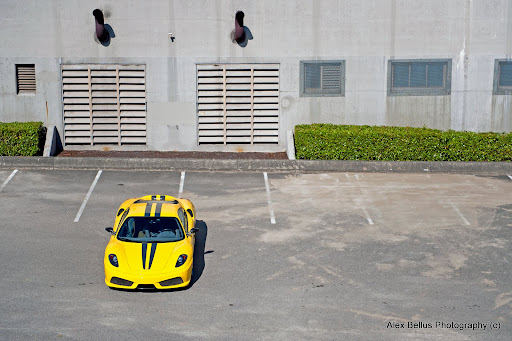
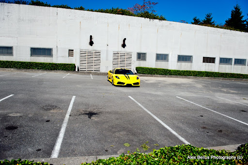
Jason, #4 and #7 because I like the view from the top and in the last photo the starkness of the gray building against the vivid yellow is cool.
It's a tie. I could never choose a winner, you're both awesome.
Jason, #4 and #7 because I like the view from the top and in the last photo the starkness of the gray building against the vivid yellow is cool.
It's a tie. I could never choose a winner, you're both awesome.
Aug 17, 2010 | 03:35 AM
#58

Teamspeed Senior Member
Joined: Oct 2007
Posts: 919
From: Seattle
Alex, #4 and #5 because they're so striking, I love the angles of the metal behind the car in the last one.
Jason, #4 and #7 because I like the view from the top and in the last photo the starkness of the gray building against the vivid yellow is cool.
It's a tie. I could never choose a winner, you're both awesome.
Jason, #4 and #7 because I like the view from the top and in the last photo the starkness of the gray building against the vivid yellow is cool.
It's a tie. I could never choose a winner, you're both awesome.
 Aug 17, 2010 | 08:43 AM
#60
Teamspeed Pro
Joined: Mar 2010
Posts: 4,454
From: Pennsylvania
Are these any better without the tilt sift effect?
I originally used the tilt shift effect on the last one to sort of blur out that oil spot on the ground. That, and I thought it looks cool. Anyway, I'm interested in hearing your feedback on these ones.
And one more bonus picture...
I originally used the tilt shift effect on the last one to sort of blur out that oil spot on the ground. That, and I thought it looks cool. Anyway, I'm interested in hearing your feedback on these ones.
And one more bonus picture...
Ya, those are looking better. But as you had it a slight blur in the last picture would look good, but not too intensive.
You guys are both really good.