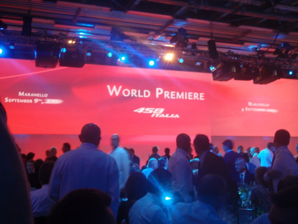
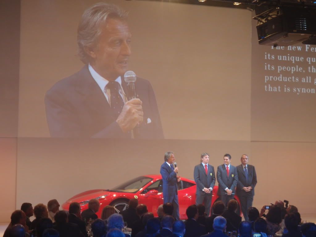
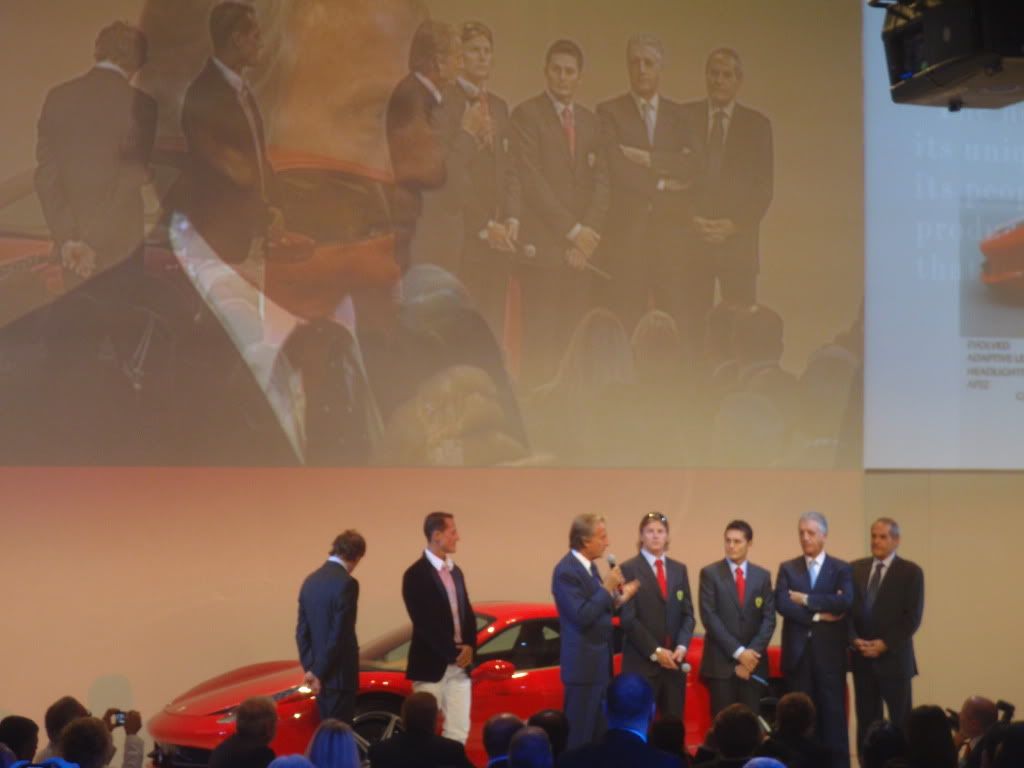
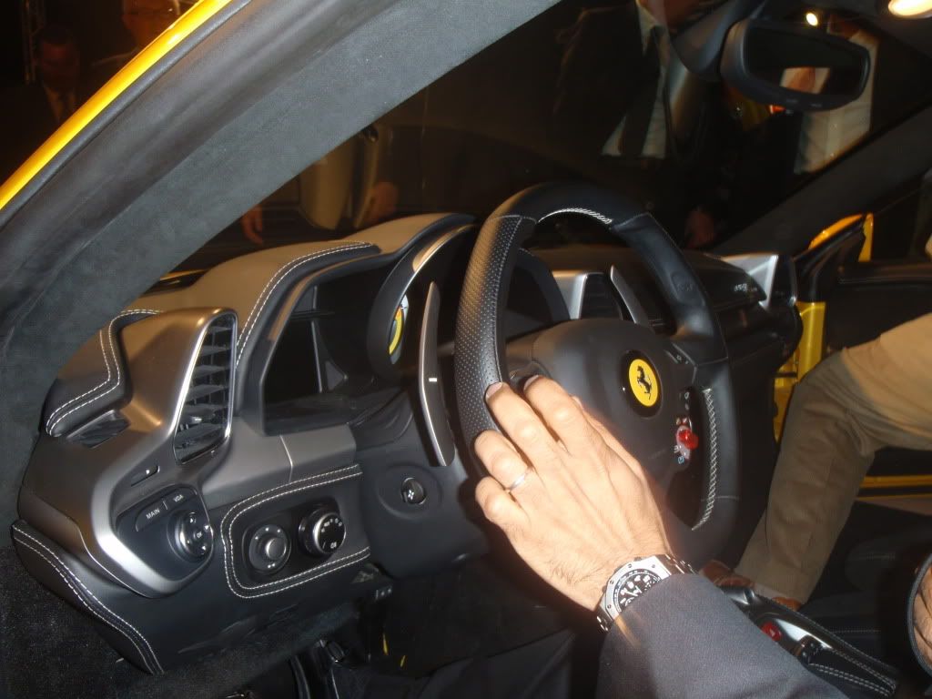
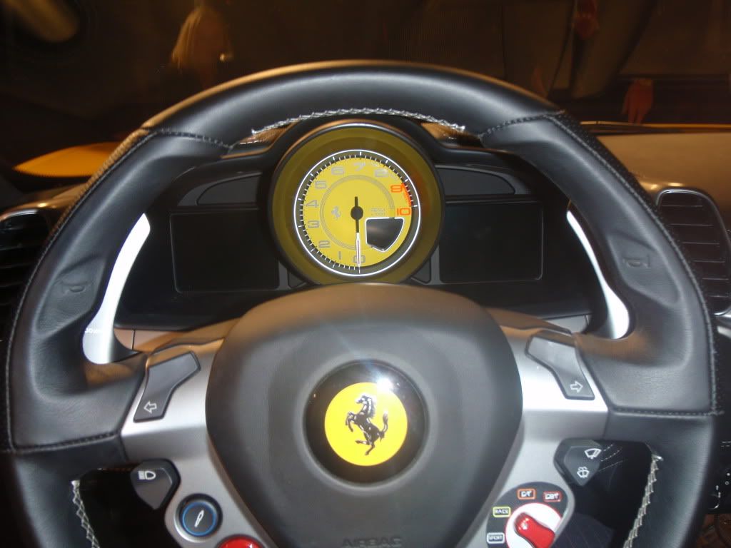
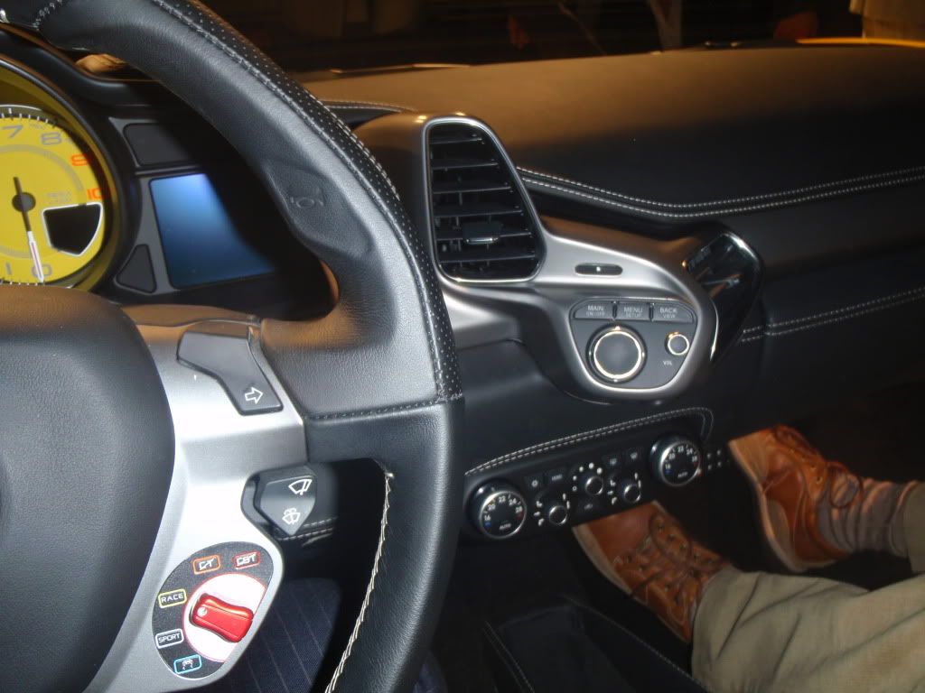
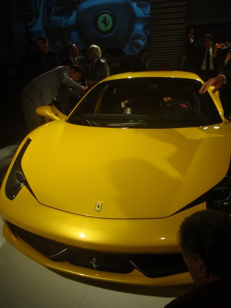
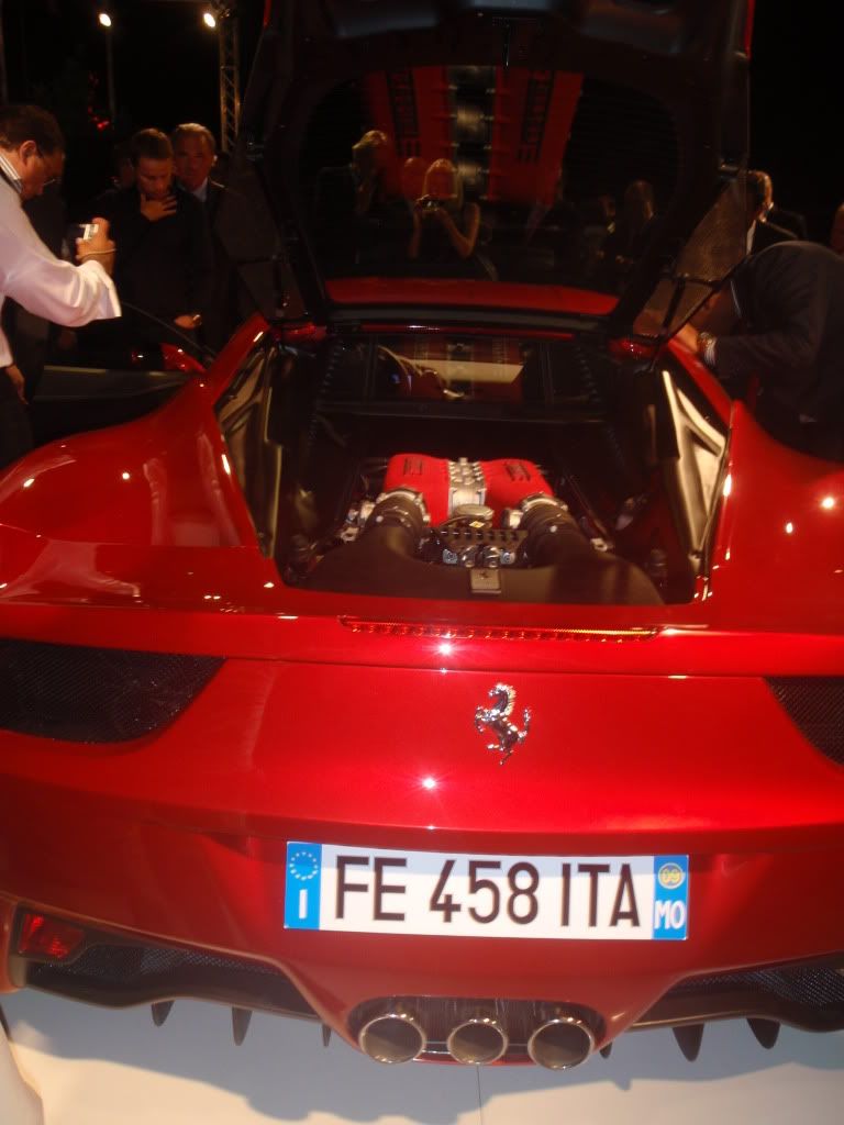
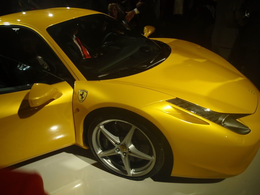
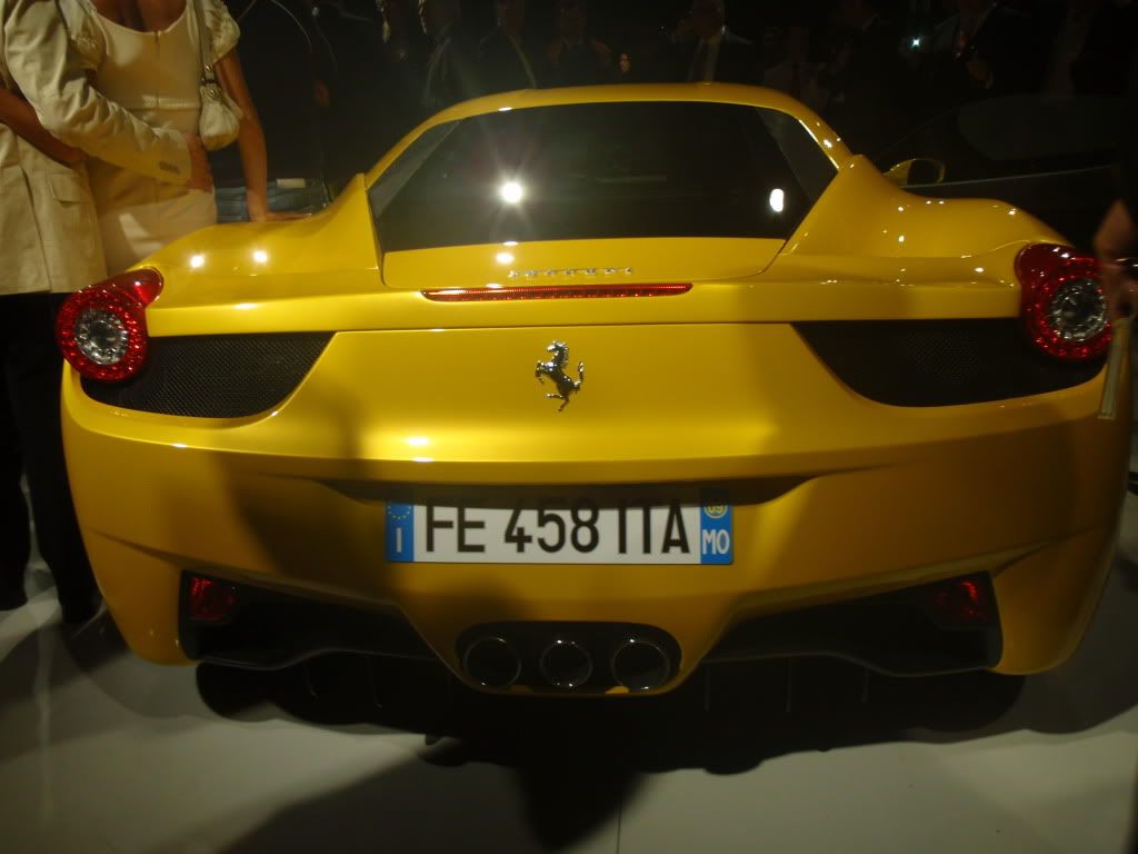
Ferrari 458 Italia Pictures - More Mobile Pics from the presentation at Fiorano
#21
I actually think that black or grey....whichever it is doesn't look good. Yellow stands out so far in pics. Interior needs to be seen in person...I think the hardest thing is not seeing Daytona seats. Oh...and I still don't see cruise control. 

#22
I have been turning away since the original studio pictures were released. I am sure it will be a great car, but the 430 has some big shoes to fill. Black isn't too bad. The whole front and the tall cockpit are just a mess.
#25
i can't quite perfectly explain my feelings about this car.. it is a beautiful car don't get me wrong but i feel like it lacks the soul of older ferrari's i mean to me the 360 modena was better looking than the 430 and this is worse looking than the 430 i just don't like the direction of design that ferrari is headed in just too modern and fancy honestly
edit: after seeing the pictures trax posted i am liking it more i feel like it will grow on me just at this point im iffy
edit: after seeing the pictures trax posted i am liking it more i feel like it will grow on me just at this point im iffy
#26
I love the F458.
This car looks beautiful from every angle. Im sorry, but I think it looks amazing. I think that once people see it in person and see all the details Ferrari put on this supercar then they will start to like it.
This car looks beautiful from every angle. Im sorry, but I think it looks amazing. I think that once people see it in person and see all the details Ferrari put on this supercar then they will start to like it.
Last edited by no limits; Sep 10, 2009 at 03:10 PM.
#30


